The short version
Salesforce is software that companies use to manage their customers: sales, support, service. Before a company can use it, someone has to set it up. That person is usually called the admin. This talk was about making that setup easy. Here is the whole thing in plain words first.
- Salesforce setup was one endless list of settings. Small companies usually have one admin, and about half of them paid outside firms just to switch features on.
- Admins struggled with three things: not knowing what a setting does, forgetting where they stopped, and getting no help when something broke. Nobody complained about clicks.
- The fix, Salesforce Go, shows what you bought, what to set up first, and how far along you are.
- The team's first grouping of features failed a test with real users. Only half the features landed where people expected.
- Feature names that say what you get ("resolve IT issues") tested better than names that describe the feature ("service operations management").
- Every feature page follows the same pattern: what it is, what you need first, switch it on, required steps, optional extras.
- When the system can't tell if a step is done, give the admin a checkbox.
- Keep measuring after launch. A later drop in satisfaction came from other teams at Salesforce using the new setup pattern in different ways.
The full notes follow.
Overview
On Saturday 31 October I went to the first session of Design School, a new series from AI Learn Circle, at Quash's office in HSR Layout. Komal Agrawal, a designer at Salesforce who worked at PayPal before that, walked us through a project she spent more than a year on: making Salesforce setup something an admin (the person who sets the software up for their company) can finish without hiring help.
Below are my notes from the talk and the Q&A. Any mistakes are mine.
Speaker: Komal Agrawal, Senior UX Designer at Salesforce, previously Senior UX Designer at PayPal
Event: Design School S1: Designing the front door (event page)
Series: Design School by AI Learn Circle, hosted by Harkirat Singh and Lekhansh Rana, with Quash as community partner
Date and venue: 31 October 2026, Quash's office, HSR Layout, Bengaluru
Nobody reads that. AI will also refuse to read that.
Komal, on Salesforce's 148-page setup guide
How design work at Salesforce has changed
Komal started with how her team works, because it changed a lot this year.
Until last year, each feature had one team of design, product and engineering, backed by research, content and accessibility. Salesforce shipped three big releases a year (winter, spring, summer), one every four months, and design lived in Figma, a popular design tool, on top of Salesforce's own library of ready-made screen parts.
Now the same people ship several features at once on a monthly release cycle. Komal rarely opens Figma. She works in AI coding tools (Claude Code, VS Code and Cursor), and the code she writes goes into the live Salesforce product through GitHub, which she had never used before May. A screen she built was presented from her own repo in this year's keynote in September, where the company used to hire outside agencies to make those videos.
Much of the work now has no screen at all. Behind Salesforce sits a huge store of customer data, and there is now a layer on top of it you can drive by typing requests to an AI. So a growing share of what designers shape is how that conversation works.
The problem: setup nobody could finish
A two minute scroll
To show the problem she played a video of someone scrolling the setup menu for one basic Salesforce product, with nothing extra installed. It ran for 2 minutes and 7 seconds. Every line in it is a setting you may need to touch to get a working product.
The room called out what was wrong, and Komal's list matched:
- Navigation is one long, endless list.
- Features are hard to find. Admins didn't know what they were installing, and anything new got lost in the list.
- Companies bought products and used only part of them, because setup was too hard.
The industry that grew around setup
Setup was hard enough that a whole industry grew up to do it. Customers buy from Salesforce, then hire a partner firm to install what they bought. For big enterprises that work is valuable and needed. For small and medium businesses it makes less sense, yet about half of them relied on outside vendors to get set up.
A small or medium business typically has between half an admin and three, one on average, according to a figure from the research firm Gartner that Komal quoted, and setup is a small part of that person's job. Salesforce's answer had been an enterprise setup guide averaging 148 pages. Nobody reads it. Komal joked that AI will refuse to read it too.
What admins actually said
Interviews changed how the team saw the problem. Admins never mentioned the number of clicks. They talked about effort:
- "Is this the right setting? What happens to me or my customers if I turn it on or off?"
- "What did I set up yesterday? Where did I stop?"
- Setup gets done between other tasks, so coming back to exactly where you left off mattered a lot.
- "If something goes wrong, I'm stuck reading in a loop and can't get help." Setup didn't fix itself or point to a fix.
The solution: Salesforce Go
Komal used the product she works on as the running example: IT Service Management (ITSM), which a company's IT team uses to track and fix problems like a broken laptop or a down server. The setup pattern the team built for it was later adopted by every other product in the company.
Level 1: a home page for what you bought
The old setup squeezed hundreds of settings into a left-hand menu, alphabetical or in one long line. Salesforce Go uses the whole screen instead. If you bought ITSM, all of ITSM's feature sets show up front, each with a short note on how it helps, what's inside and how setup works. It also recommends what to install first and separates the base setup from extras you might add later.
That handled the long navigation and made features easier to find. Things were still nested, but in bigger, clearer chunks.
Grouping features: testing with real people
Clicking into a feature set still meant facing a hundred options, so the team had to group features properly. Their first version had six buckets, based on four things:
- Standard industry ways of organising IT service work.
- How other tools in the same space group their features.
- What the team's product managers and researchers knew.
- Whether the groups fit the setup pattern they were designing, or the design had to change to fit the groups.
Then they tested it with a method called a card sort. Each feature goes on a card, and people sort the cards into the groups where they would expect to find them. The team ran it online, without anyone watching, with 25 people who do IT service work in other tools (Salesforce had no ITSM product before, which is why ITSM became the first product to get the new setup). Each person sorted 26 feature cards into the six buckets.
Only 13 of the 26 features landed where the team expected. Some feature sets matched just 22% of the time. Features that people split between two buckets scored even lower.
The team found four causes:
- Salesforce jargon. Product names mean nothing outside Salesforce. Say "dashboards" or "visualising a lot of data" and people get it.
- A set name so generic ("ITSM processes") that people dropped everything into it.
- Features that reasonably belonged in more than one bucket.
- Names that described the feature instead of what it does for you.
Name each feature by the job it does
After three or four rounds with end users and internal teams, the rule became: a feature set's name should say what the admin is trying to get done. "Service operations management" became, in effect, resolving issues with your IT processes. "Unified communication and self-service experience" became delivering service across multiple channels. The team framed every name around the job the admin wants done.
The six buckets came down to four. Some were dropped and some were moved out of the first release.
Level 2: what's inside each set
Clicking a feature set opens a level 2 page listing the features you should expect inside it, each with a clear line on what it does.
Level 3: one page to set up one feature
That still left adoption. With 150 features to install, how do you know what's done and where to go next? The team designed a standard level 3 page for setting up a single feature. In its final form, top to bottom:
- Feature name and progress. A breadcrumb (a small trail of links at the top) shows how you got here and which set you came from, what the feature does, and how many steps you've finished.
- Prerequisites, if any.
- Turn it on. Some features have a toggle you can switch on and off. Others can only be switched on; turning them off means wiping the whole system.
- Required steps. Skip one and the feature won't work.
- Optional steps, for using the feature to more of its capability.
- Recommended add-ons, a small sales pitch at the end.
Some steps still sent admins to the old setup screens. Older products couldn't move to the new setup pages in the first release, so those steps are redirects for now. Steps that only need a little input open a pop-up window, and steps that need nothing more are an on/off switch.
When the system can't tell if a step is done
The progress counter caused a real design problem. For some steps the system can't tell whether the admin finished. Some steps also repeat: you add two users today and 200 tomorrow, and the step is still "done". So the counter always showed incomplete steps and was close to useless.
The fix was a manual checkbox. If the system can detect a step is done, it ticks it. If it can't, the admin ticks it, and the counter moves. It works like a checklist. Komal pointed out later that no admin asked for a checkbox. The need showed up in usability testing, when admins kept losing track of where they were.
One feature, two products
Some features sit inside several products. Knowledge (a library of help articles), for example, is needed by both ITSM and Sales Cloud, Salesforce's sales product, but behind the scenes it is one single feature. Once you install it from one product, you can't install it again from the other. The answer was simple: one level 3 page, reached from both products. Only the breadcrumb changes, and the progress is the same from either side.
Two kinds of dependency
Many features depend on something else: another feature, terms you have to accept, or a license (a paid right to use a product) you don't have. The team split these into two kinds:
- Blocking. You can't install the feature here at all, so the page tells you where to go. This is mostly for missing licenses or system limits.
- Pre-enablement. You need to do a few things first, and you can do them on the same page. Komal's example: before AI can resolve incidents straight from email, you need the feature that turns emails into incidents.
What changed
Over the 11 months the team tracked:
- More than 1 million visits to the Salesforce Go home page.
- 15,000 feature setups across 6,500 customer accounts (Salesforce calls each one an org).
- 8,200 features switched on.
- 10x growth in features overall, with adoption up across products.
Komal summed it up as simpler setup, customers getting value sooner, and features people could find.
What's next: sample data, agents, and no UI at all
Komal described the next steps:
- Go Accelerate (live): cuts setup down to the minimum, and ships products with sample data so admins don't land on empty screens and can try real actions straight away.
- AI helpers (live): AI agents, assistants that can take actions for you, now come with the software. You chat with one in a side panel, and fixing problems has become much faster.
- Setup with no screens (in progress): you connect an AI assistant like Claude to Salesforce, say "install ITSM", and it does it. Komal is working on the design of this part now.
What Komal took from the project
- Start with the problem and design for your end users. A product manager's request is where you start checking.
- Part of the solution comes from understanding how the information is organised. You don't design a setup flow by starting with "what's your name".
- Test how you group things and the words you use, even when they seem obvious to you.
- Design a UI people can trust. Small things build it: a progress bar, the status of each step, telling people where a download went, double confirmations.
- Build patterns that can be reused. Every product at Salesforce now uses this one.
- Keep measuring after launch. Around February the team saw usage and customer satisfaction scores dropping after a strong year. Research showed some teams had built the pattern incorrectly, so the experience had become inconsistent. You measure to catch failures too.
Questions beyond the slides
Doesn't an in-app chatbot solve this?
Someone asked why not add a chatbot that guides you or does the setup for you. Komal said that work exists but she couldn't show unreleased parts. What's public is the AI helpers above.
How do you add features without breaking what people learned?
A design system handles visual consistency. For features, Komal gave a real trade-off. Some installs didn't fit in a pop-up window, and the team debated adding a fourth level of pages. They kept everything at level 3 for consistency, even though a few features would have been easier with a fourth level. She said hard calls like that come with the job.
On the learning curve: enterprise admin work is hard, and much of the learning curve comes from the domain itself. Nobody wakes up and decides to use Salesforce for fun. Bigger customers also have separate teams for installation.
How do you handle users who are used to the old way?
Komal's example was service maps: diagrams that show how a company's routers, computers, servers and cloud storage connect. Salesforce keeps these in a database called a CMDB. To anyone else the maps look unreadable. The IT people who manage them read them fine. The team redesigned them to look much nicer and tested them. Users said they loved it, then asked for five more features. They wanted a timeline feature more than a prettier diagram. Her point: priorities come from what customers want, even when you'd rather build something else. Most of those decisions come from qualitative research.
How do you know a problem is worth solving?
There are 18 to 21 well-known methods designers use to find problems, such as Crazy Eights (sketching eight ideas in eight minutes), card sorting, usability testing (watching people use the product) and the five Ws. The skill is knowing which one to use when. Problems come from two places: users, through these methods, and the business, for example a feature five competitors already have that no customer has asked for yet. Enterprise users tend to report problems after they hit them. Users who ask for things in advance show up more in retail.
For numbers, she pointed to measures like how many users sorted features the way the team had grouped them (about half, here), plus usage after launch. When nobody adopts something you built carefully, talk to the people who aren't adopting it.
Figma or prototypes for testing?
The Salesforce Go work was tested on clickable mockups made in Figma. Now the team builds working prototypes and tests those with users.
Who ran the research?
It depended on the stage. The research team ran the deep-dive concept interviews (what problems do you have with setup today). Komal set up the card sorts, with no screens, run online without anyone watching. The research team ran the final round with screens: would you use this, and if not, why not. On her current CMDB work, she runs the interviews herself. It depends on the product's team capacity.
How do you get users to give you their time?
They pay them. Komal said it varies by project. Most of their interviews run on usertesting.com or userinterviews.com, which anyone can sign up for, and many big tech companies recruit there.
Is redesigning a cluttered product harder than starting fresh?
Much harder, Komal said, and the clutter is often there for a reason. Much of what runs behind the screens is 30-year-old software. Some features sit too close to the core (a Salesforce term for its most protected systems) to pass the security bar for the new setup pages, so they can only be set up in the old interface. She hears about these limits from product managers and engineers. You design with constraints. If 99 features are in the new setup and one lives somewhere else, you live with it.
What metrics proved it worked?
For this project: home page visits, logins and features switched on. Metrics differ per project. For ITSM as a whole, the company tracks customers and revenue, but revenue doesn't tell you how good the design is. Her own numbers are about single flows: how many people fix a reported problem through screens she designed, or how many finish a setup she designed. They also use NPS, a standard survey score of how likely customers are to recommend a product, and part of the data in the talk came from those surveys.
Customers or partners?
The page is for customers. Big enterprises (around 1,000 employees and up) usually bring in a partner, inside or outside Salesforce. Small and medium businesses use the setup screens directly, with help from Salesforce's setup teams and salespeople, who are trained on new launches so they can sell and support them. Komal's view: the problem is the same whoever does the setup. You still have to get a feature from off to working, and many of these setups repeat monthly or yearly, so in the long run the customer has to be able to do it.
The whole session on one page
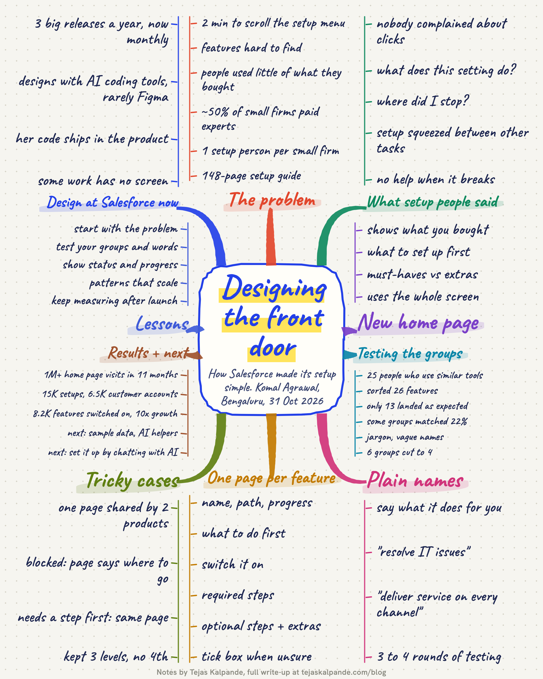
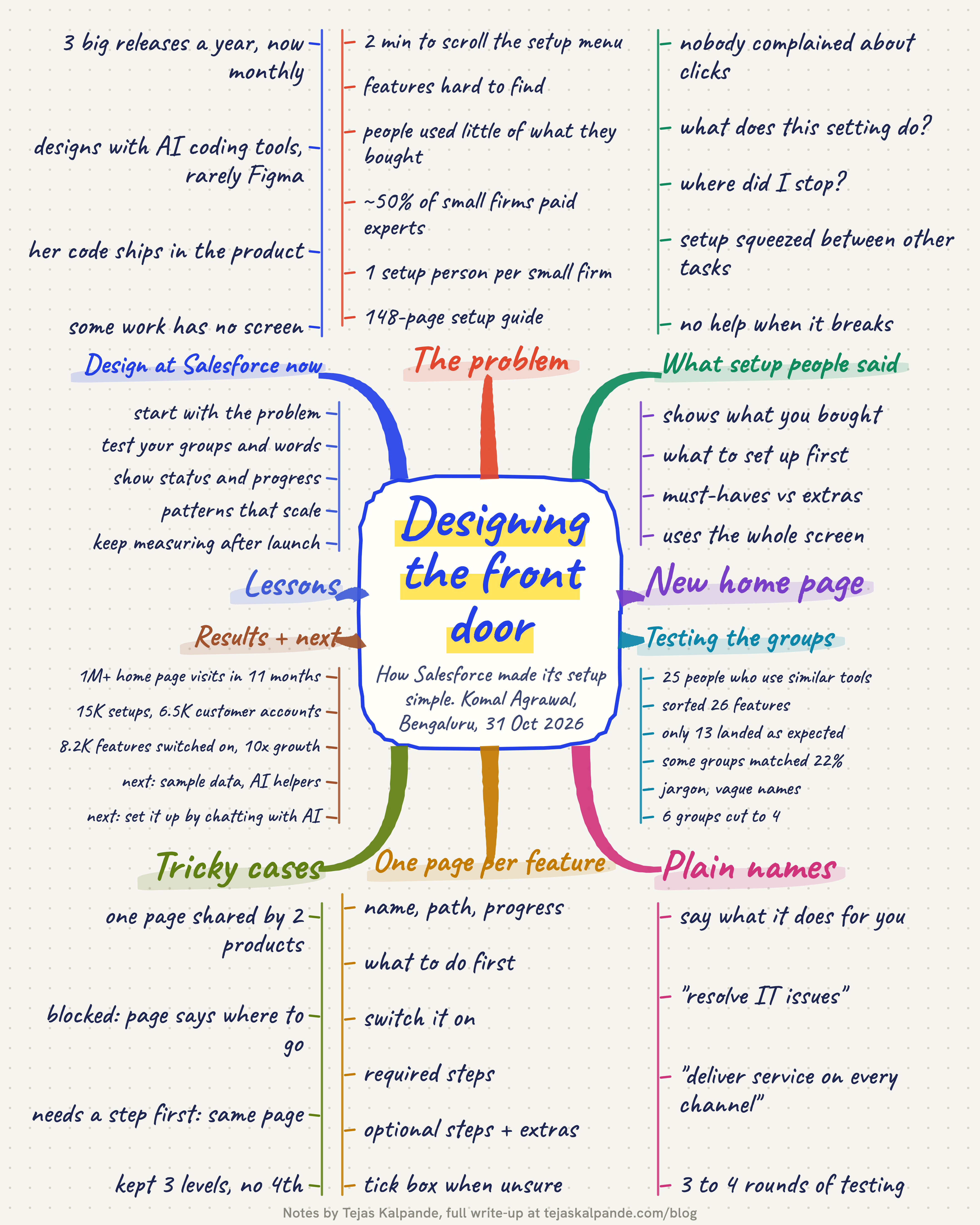
Here is the whole session as one mind map, to save for later.
Key takeaways
- Find out what costs your users effort. Counting clicks won't tell you.
- Test your grouping with real users before you design screens. Half of a careful first version can be wrong.
- Name features by the job they do for the user.
- Give every setup page the same skeleton, so people learn it once.
- When the system can't know a step is done, let the user tick it.
- Keep the pattern consistent, even when a few edge cases would fit better elsewhere.
- Keep measuring after launch, and treat a drop as something to research.
Thanks
Thanks to Komal Agrawal for walking us through a year of real work, trade-offs included, and to Harkirat Singh, Lekhansh Rana and the AI Learn Circle team for starting Design School. Thanks to Quash for hosting us at their office.
Related: Claude as Your GTM Co-Pilot, with Harkirat Singh of AI Learn Circle